Navigation
Summary metrics and trendlines
Credit: U.S. National Science Foundation
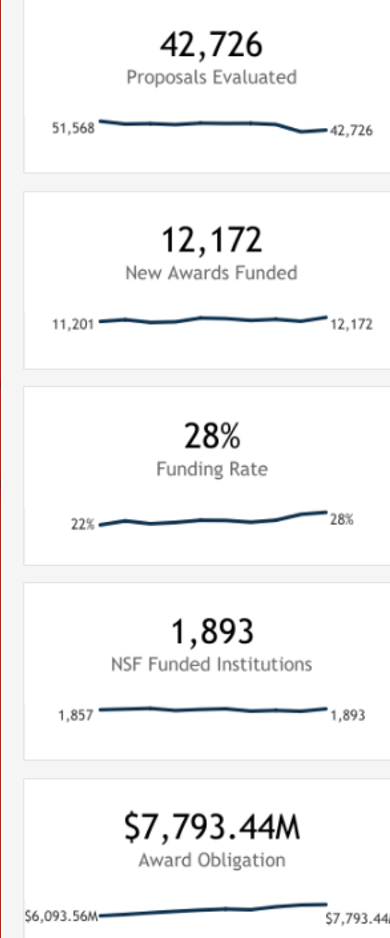
By selecting the summary metrics above the trend line (with the exception of "Funding Rate" and "NSF Funded Institutions"), the title and data of all views in the dashboard will be updated.
NOTE: Selecting "Funding Rate" or "NSF Funded Institutions" will not refresh the dashboard and will not update any metrics.
These trendlines show the overall NSF trend for each metric for fiscal years ranging from 2013 to 2022.
Selecting any filter in the dashboards, except for "Fiscal Year," will update the trendlines according to the filter selected.
State map
Credit: U.S. National Science Foundation
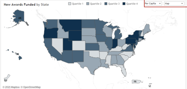
The map view has two filters:
- Total/Per Capita: "Per Capita" shows the metric selected divided by the population for each state (in millions of people). "Total" shows the metric value with no further calculations.
- Map/Bar Graph: This filter enables the user to toggle between a map view (default) or a bar chart view.
The map view shows the selected metric broken out by quartiles, with the density of color representing higher metric values as indicated on the legend. Selecting "Quartiles" will highlight the states accordingly.
Clicking on any state map filters the entire dashboard to that state and opens a congressional district map for that state.
NSF organization
Credit: U.S. National Science Foundation
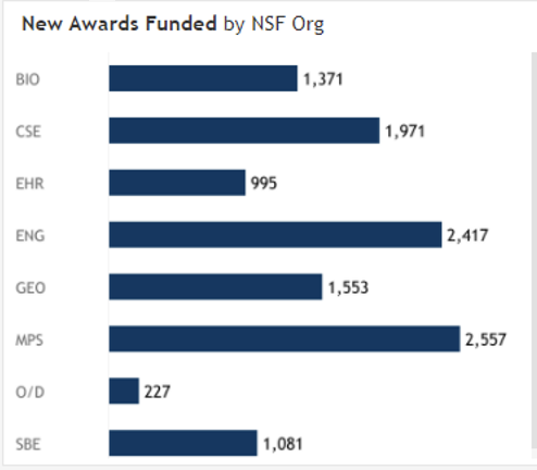
The NSF org view breaks down award funding by directorate within NSF.
Clicking on any NSF org name will filter the entire dashboard to that directorate values.
Institution
Credit: U.S. National Science Foundation
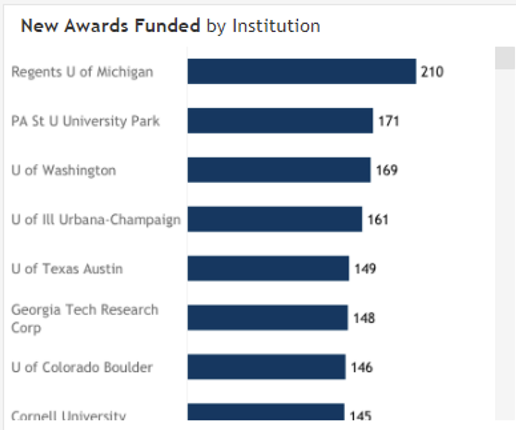
The institution view displays a breakdown of a selected metric by the institution. Institutions will be filtered further based on the selected state in the map or the selected NSF org. Clicking on any institution name will filter the entire dashboard for the selected institution.

